Viví Okey

Taking care of who you love.

Vivi Okey aims to streamline your daily routine by offering a new approach to digital healthcare and assistance services. We took the challenge of developing the brand identity system for this cutting-edge healthcare digital system.

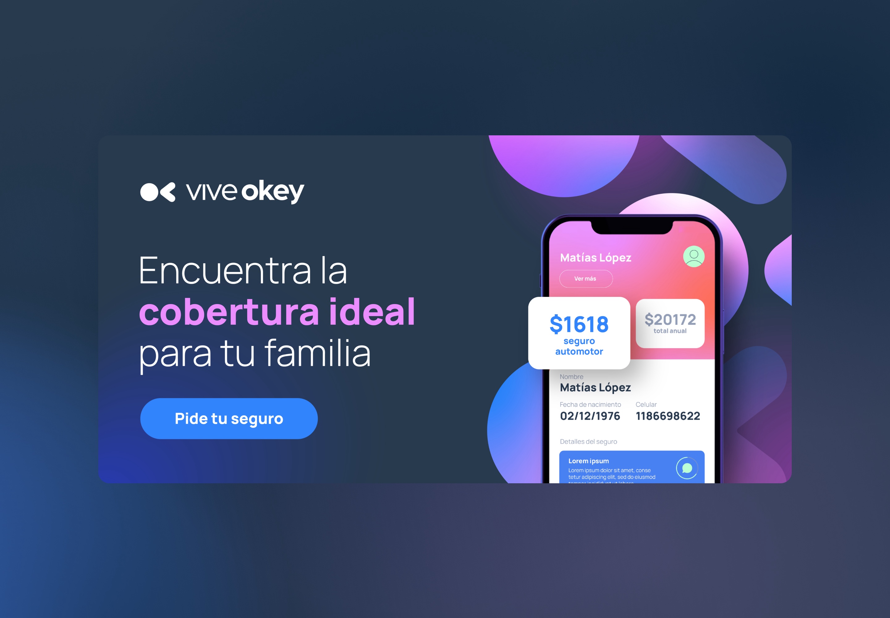
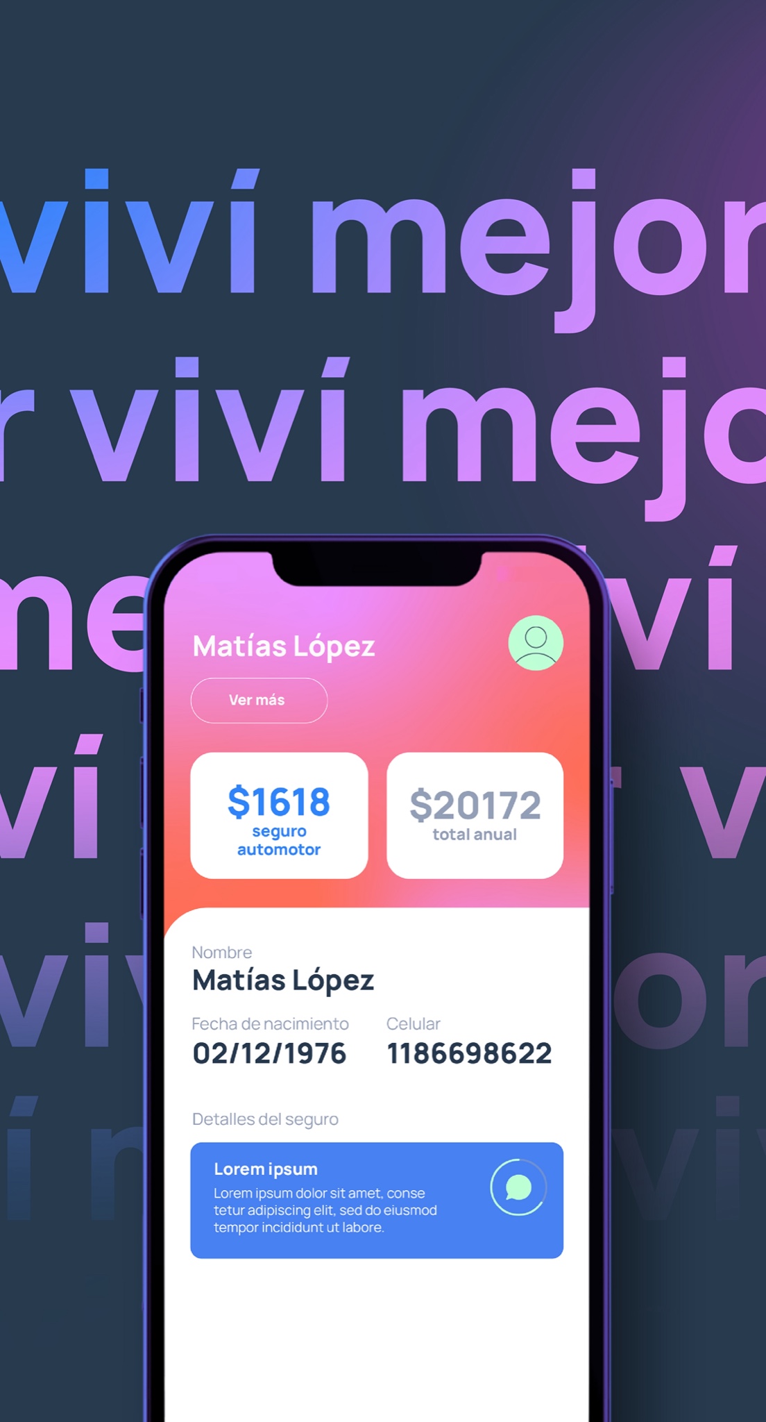
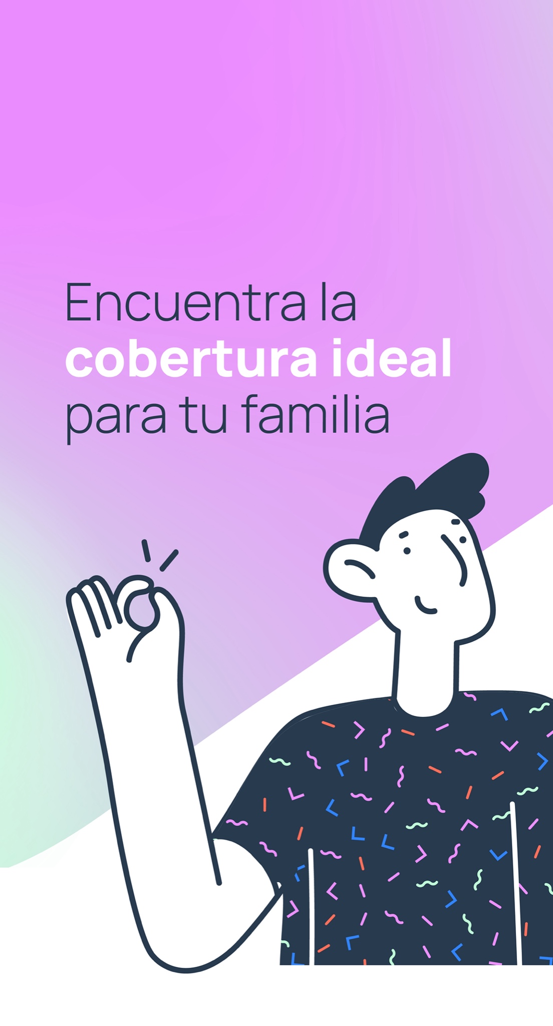
Branding the first step into building the next InsureTech company.

Insurance, often associated with complex policies and risk management, can feel distant and impersonal. A relatable branding design bridges this gap by incorporating elements that resonate with human experiences and emotions. From empathetic visuals to inclusive messaging, a human-centered approach communicates trust, care, and understanding. Relatable design choices, such as using bright colors, friendly illustrations, and images depicting real-life scenarios, foster a sense of connection with customers. This approach not only demystifies the intricacies of insurance but also reinforces the company's commitment to being a supportive partner in safeguarding the well-being and aspirations of individuals and families.

Kindness in design.

Kindness in design is pivotal as it places the user's needs and emotions at the forefront, creating a positive, empathetic experience. It involves a user-centric focus, promotes inclusivity and accessibility, evokes positive emotions, prioritizes ease of use, and builds trust through transparent and ethical practices. A kind design approach fosters long-term customer relationships by consistently delivering positive experiences and demonstrating care for users' well-being.

Project summary

Competitive benchmarking, Low-fi prototyping, Hi-fi prototyping, Identity development.

Branding
Illustration
Icon Design
Visuals
ADs
Keep it simple.

This geometric, simple, and playful logo combines clean lines and shapes with a lighthearted, approachable vibe. The use of basic geometric elements ensures simplicity, conveying a modern and organized feel. The playfulness comes through in the design's creative use of shapes, incorporating cheerful colors and the articulation between the 2 shapes.

Duotone, outline and solid icons.

Illustration library

Photo and color articulation

Use of the logo shapes for patterns and brackgrounds